-
Steam recently changed the default privacy settings for all users. This may impact tracking. Ensure your profile has the correct settings by following the guide on our forums.
You are using an out of date browser. It may not display this or other websites correctly.
You should upgrade or use an alternative browser.
You should upgrade or use an alternative browser.
How do I convert a PSD web layout into a fully fledged HTML/CSS site?
- Thread starter Vee
- Start date

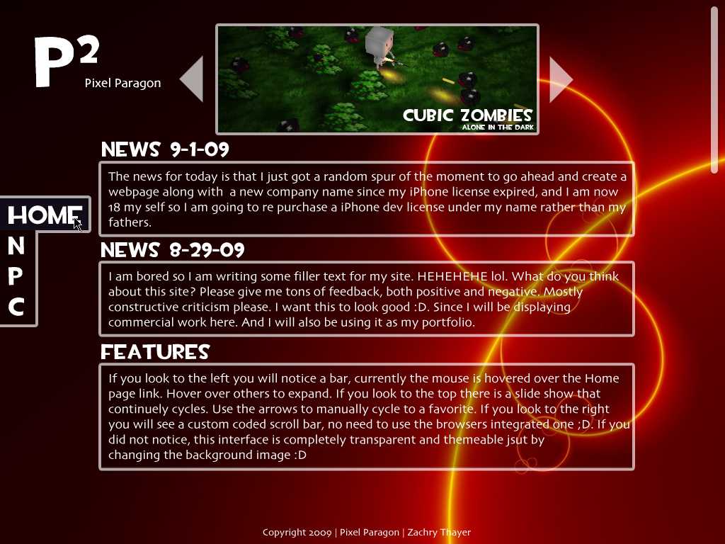
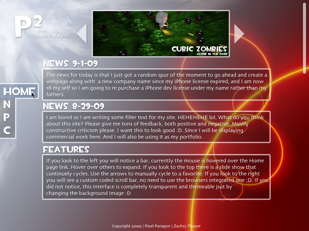
Much better, yet the bevel is out of place and the font within it is too large. However it is not a bad style at all. The C4D render could use some more 2D flare along with it, and some other tweaking to make it more integrated rather than just sitting there, but you are definitely getting better.
Much better, yet the bevel is out of place and the font within it is too large. However it is not a bad style at all. The C4D render could use some more 2D flare along with it, and some other tweaking to make it more integrated rather than just sitting there, but you are definitely getting better.
Thanks for those tidbits, i'm changing them around now! Are you any good at HTML/CSS coding yourself?
IMO it would look much better with that C4D render removed completely... it doesn't really fit in with the colour scheme and it also pulls the eyes away from the text.
Thanks. I originally did it without out the C4D, that was something i only recently added. I'm going to ask around some more and see what the general concensus is.
Thanks for the great feedback though!
")
explosions
Member
"a amalgamation". Tsk tsk.
Moose
Meta Moose
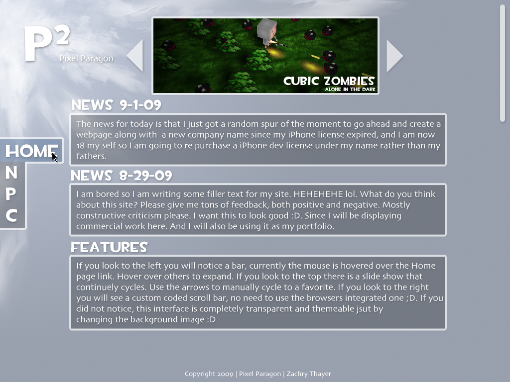
If you intend to use those arrows as a way for the user to scroll through images, then I suggest you take a look at jQuery. Also, to code this in CSS/HTML you will need to cut up your PSD into the bits you need, IE:
1. Navbar buttons (just the background image for the text to go on, unless you want the text to be an image too).
2. Logo
3. Scroll arrows, or whatever you want to call them
4. Cut up the container for the text at the bottom into 8 pieces (4 corners, 4 sides). The sides only need to be 1px in height/width (depending on whether they are a top/bottom side or left/right side, if you catch my drift) as you can repeat them using CSS so there is no need for the user to load a large file.
That's an example, but is how I would go about doing this.
EDIT: I am still learning too, so don't take my word on this.
explosions
Member
To answer your question, Yes I actually am very good with HTML/XHTML/PHP/CSS/Javascript.
Designing, I agree you are. Security....you need to work on that.
If you intend to use those arrows as a way for the user to scroll through images, then I suggest you take a look at jQuery. Also, to code this in CSS/HTML you will need to cut up your PSD into the bits you need, IE:
1. Navbar buttons (just the background image for the text to go on, unless you want the text to be an image too).
2. Logo
3. Scroll arrows, or whatever you want to call them
4. Cut up the container for the text at the bottom into 8 pieces (4 corners, 4 sides). The sides only need to be 1px in height/width (depending on whether they are a top/bottom side or left/right side, if you catch my drift) as you can repeat them using CSS so there is no need for the user to load a large file.
That's an example, but is how I would go about doing this.
EDIT: I am still learning too, so don't take my word on this.
I've actually already configured a JQuery image slider. Thats about the only pro-active thing i've done! As for the rest of your tips, thanks. I've already got that far in terms of understanding (via tons of tutorials). If you do ever learn the ins and outs of PSD conversion, give me a shout!
I'm going to need you help then! I'll contact you.To answer your question, Yes I actually am very good with HTML/XHTML/PHP/CSS/Javascript. I was sorta bored so I whipped up a mock site in photoshop hehe. I think im going to make it into a real site soon.
Designing, I agree you are. Security....you need to work on that.
FYI that script is from when I was learning php
I had completely forgot about it.explosions
Member
FYI that script is from when I was learning php
Always, always, always look for ways into your own script. Just a few words of advice.