Well I wanted it to resemble the site's image in one way or another, the current logo doesn't seem to represent us. Like I mentioned, Engadget has the radio waves (which makes sense since they are a gadget blog, wifi/radio waves are pretty common knowledge and identifiable to most people who read the site).
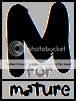
The other problem I had with the current logo was it wasn't easy to transfer it into a watermark (the white text proved troublesome to show up properly in images/video. Also I was hoping we could form a "logo" that is identifiable without the inclusion of our "for mature" text, so two M's together would suit us better or even the ESRB rating design (although I'm pretty sure modeling our logo after that would enter some grey area in copyright protection).
For example (for watermark purposes the double M's could be used without the text and people should still be able to identify it with our site. The other image, the M within a box somewhat resembles the ESRB rating, again, allowing readers to identify it with our site.
I was just throwing ideas out and wanted to see what the community could come up with. I like the design of the current logo, but I just wanted to see what others could come up with since we just kind of went with this logo after Nevada came up with it and didn't really look back since then.
I don't like my designs either, but that's why I've created this thread: to see what people could do with the concepts I put forth or to get their input, like you've given (current logo being fine).
As far as the watermark issue goes, just take the logo and cut out the wavy lines. Then if needed put a black semi-transparent rectangle behind it or something. That would make it stand out easily on white backgrounds, and still look good.
") Which is why I created the second concept image without two M's combined
Which is why I created the second concept image without two M's combined