Yeah good call, updated it to 3DO now.Awesome, beautiful work!
How about "3DO Interactive Multiplayer" name, maybe just leave it with "3DO"?!
-
Steam recently changed the default privacy settings for all users. This may impact tracking. Ensure your profile has the correct settings by following the guide on our forums.
-
If your profile is showing up as Not Ranked, please review our rules page and follow the appeal process detailed there.
You are using an out of date browser. It may not display this or other websites correctly.
You should upgrade or use an alternative browser.
You should upgrade or use an alternative browser.
Game Database Additions & Corrections
- Thread starter x3sphere
- Start date
tyl0413
Member
Would it be possible to introduce a "No longer obtainable" flag alongside the current "(was always) "Unobtainable""? For example when multiplayer servers shut down? Just good information to have available when browsing achievement lists. Would help with moderating cheaters as well.
That's most likely not an error as there are often separate trophy sets for different regions, you'll notice it with plenty of other games, don't worry about it3 leaderboards for Genshin impact
View attachment 11773

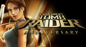
I'll take care of that when I get home, thanks.Not sure if this is the right place to post this, but one of the header images of Tomb Raider Anniversary (PSP Retroachievements) is of an Interactive Demo Disc instead.
b864603.png:

Thanks for all your hard work!
RubiS
Member
Add plz xbox series to https://www.exophase.com/game/crossfirex-xbox/
Done!
Both were added!
Thanks!!Both were added!
Agravaile
Member
So here's a thought that was brewing in my mind for a long time since there was a need for uploading thumbnails mostly for retro games, but not exclusively, since also XBOX, Steam and now even PS5 do also require updated thumbnails for the website for the sole reason of not following the 320x176 format, which came from Sony's side, as being a standard for trophy packs inluding PS3, PSVita and PS4, and even they have deviated from it already, which made me think of a possible solution in order to accomodate all of the different formats.
So, the problem that also made me think about it was when same games but in different trophy thumnbails formats needed to have their thumnbnails updated, which was followed by the pattern of "One same thumbnail for each version of the game" which would suit it well, but in cases when developers made two different arts for each format, that what made me thinking that it would kinda be a loss of the original art if it's replaced by something that is, on one hand, acomodates website's design, but on the other, loses the original art it was supposed to have on the thumbnail.
The problem continues when you start working with retro titles as well, but in a bit different form, which also crosses alongside with X360 games, since retroachievements have inherited all of the design patterns from it. So, it started to involve plenty of work which would require to find, and in most of the cases even create and artwork that would reflect the game in one way or another without losing it genuine feel, which is why we do have this thread of artwork submissions, but then it is starting, and i think already is looking like an overwhelming work for countless games that already have their thumnbails from it's authors, the reason they're needed here is, obviously, for the website's formnat which inherited, on the contrary, PS3's design of trophy pack thumbnails.
It is not the amount of work that is my main concern, though, but preserving the genuine thumbnail artworks selected not only by authors of Retroachievements, but the devs themselves of such formats as Steam, X360 and now PS5 which for most wouldn't matter, but i do think that retaining the "official" look as possible for every trophy pack on the website is the way to go. Of course, with every decision the admins will take, i completely respect, but i still think it's worth it to pitch this idea of mine which make everything not only more genuine and official, true to what devs intended to be on the artwork, but would also free the admins from a lot of work and hassle of trying to find a suitable artwork, since the artworks would be already there, obviously...
Of course, from there, the core problem is the format, so, what would be a way to solve it?
I personally haven't come up with anything better than, if would be possible of course, i can't say i'm familiar with the ins and outs of the website, but incorporate somehow all of the (That would be 3? No, i think 4 if we count Xbox One also.) all available formats mixed in between all the platforms. A screenshot would an example of what i'm trying to say. I believe since some changes for replacing the artworks mostly for retro games have been made, it would require some work, but i can't imagine any better idea than this, for now.
Just an idea, though. By no means i'm against any decisions made by the website, but i would honesly like your opinion about it, if i managed to explain myself well, of course. The main goal, is just to retain all of the original artworks without replacing them with something that wasn't intended by the devs, which would, also remove any posibilities if someone would, say, want to argue that one or another artwork "doesn't match rather well for the game" for example.

Edit: There's also a different example that came to mind and it was "Nier: Automata" which had different artworks for Xbox and PS4, for example. Both are different artworks provided by the developers, but one of them being lost to accomodate the format of the website, with which, of course, not against any decisions made by the website, but in my own opinion something that was sourced by the devs should be kept original. That is in my own opinion, though. All of the decisions are up to you! Just a thought i wanted to share, nothing more.
Edit 2: The way PSNProfiles also took this approach is descriptive of the idea too!

Thanks in advance!
P.S: Oh, i also apologize for posting this in the corrections thread, haven't realized too soon that i should've done it in the Game Icon Submissions i guess.
So, the problem that also made me think about it was when same games but in different trophy thumnbails formats needed to have their thumnbnails updated, which was followed by the pattern of "One same thumbnail for each version of the game" which would suit it well, but in cases when developers made two different arts for each format, that what made me thinking that it would kinda be a loss of the original art if it's replaced by something that is, on one hand, acomodates website's design, but on the other, loses the original art it was supposed to have on the thumbnail.
The problem continues when you start working with retro titles as well, but in a bit different form, which also crosses alongside with X360 games, since retroachievements have inherited all of the design patterns from it. So, it started to involve plenty of work which would require to find, and in most of the cases even create and artwork that would reflect the game in one way or another without losing it genuine feel, which is why we do have this thread of artwork submissions, but then it is starting, and i think already is looking like an overwhelming work for countless games that already have their thumnbails from it's authors, the reason they're needed here is, obviously, for the website's formnat which inherited, on the contrary, PS3's design of trophy pack thumbnails.
It is not the amount of work that is my main concern, though, but preserving the genuine thumbnail artworks selected not only by authors of Retroachievements, but the devs themselves of such formats as Steam, X360 and now PS5 which for most wouldn't matter, but i do think that retaining the "official" look as possible for every trophy pack on the website is the way to go. Of course, with every decision the admins will take, i completely respect, but i still think it's worth it to pitch this idea of mine which make everything not only more genuine and official, true to what devs intended to be on the artwork, but would also free the admins from a lot of work and hassle of trying to find a suitable artwork, since the artworks would be already there, obviously...
Of course, from there, the core problem is the format, so, what would be a way to solve it?
I personally haven't come up with anything better than, if would be possible of course, i can't say i'm familiar with the ins and outs of the website, but incorporate somehow all of the (That would be 3? No, i think 4 if we count Xbox One also.) all available formats mixed in between all the platforms. A screenshot would an example of what i'm trying to say. I believe since some changes for replacing the artworks mostly for retro games have been made, it would require some work, but i can't imagine any better idea than this, for now.
Just an idea, though. By no means i'm against any decisions made by the website, but i would honesly like your opinion about it, if i managed to explain myself well, of course. The main goal, is just to retain all of the original artworks without replacing them with something that wasn't intended by the devs, which would, also remove any posibilities if someone would, say, want to argue that one or another artwork "doesn't match rather well for the game" for example.
Edit: There's also a different example that came to mind and it was "Nier: Automata" which had different artworks for Xbox and PS4, for example. Both are different artworks provided by the developers, but one of them being lost to accomodate the format of the website, with which, of course, not against any decisions made by the website, but in my own opinion something that was sourced by the devs should be kept original. That is in my own opinion, though. All of the decisions are up to you! Just a thought i wanted to share, nothing more.
Edit 2: The way PSNProfiles also took this approach is descriptive of the idea too!
Thanks in advance!
P.S: Oh, i also apologize for posting this in the corrections thread, haven't realized too soon that i should've done it in the Game Icon Submissions i guess.
Last edited:
simpjkee
New Member
Here's 2 Google Play games that are currently listed as "Unknown Games".
1. Splash: Underwater Sanctuary vs. Splash: Ocean Sanctuary
Splash: Underwater Sanctuary was created by DeNA Corp. towards the end of 2013 IIRC. In late Summer/Early Fall 2014, DeNA Corp. was bought out or rebranded or something as Runaway. The DeNA Corp. game was then delisted on the Google Play store and relisted with a new achievements list as Splash: Ocean Sanctuary under the Runaway name. You can currently download Splash: Ocean Sanctuary currently and it is listed correctly on Exophase except that the URL is "splash-underwater-sanctuary". It should be "splash-ocean-sanctuary". Splash: Underwater Sanctuary is listed as an 'Unknown Game". I attached the original picture and icon for Splash: Underwater Sanctuary from my Google Play Games account. I could provide a pic with better resolution if needed.
Splash: Underwater Sanctuary: https://www.exophase.com/game/unknowngame-android-16-2/achievements/#2616441
Splash: Ocean Sanctuary: https://www.exophase.com/game/splash-underwater-sanctuary-android/achievements/#2616441


2. Flutter vs. Flutter: Butterfly Sanctuary
Similar issue with Flutter. Flutter was originally made by DeNA Corp. and was listed on Google Play. The DeNA Corp. game was then delisted and relisted as Flutter: Butterfly Sanctuary by Runaway.
Flutter: https://www.exophase.com/game/unknowngame-android-64/achievements/#2616441
Flutter: Butterfly Sanctuary: https://www.exophase.com/game/flutter-butterfly-sanctuary-android/achievements/


1. Splash: Underwater Sanctuary vs. Splash: Ocean Sanctuary
Splash: Underwater Sanctuary was created by DeNA Corp. towards the end of 2013 IIRC. In late Summer/Early Fall 2014, DeNA Corp. was bought out or rebranded or something as Runaway. The DeNA Corp. game was then delisted on the Google Play store and relisted with a new achievements list as Splash: Ocean Sanctuary under the Runaway name. You can currently download Splash: Ocean Sanctuary currently and it is listed correctly on Exophase except that the URL is "splash-underwater-sanctuary". It should be "splash-ocean-sanctuary". Splash: Underwater Sanctuary is listed as an 'Unknown Game". I attached the original picture and icon for Splash: Underwater Sanctuary from my Google Play Games account. I could provide a pic with better resolution if needed.
Splash: Underwater Sanctuary: https://www.exophase.com/game/unknowngame-android-16-2/achievements/#2616441
Splash: Ocean Sanctuary: https://www.exophase.com/game/splash-underwater-sanctuary-android/achievements/#2616441
2. Flutter vs. Flutter: Butterfly Sanctuary
Similar issue with Flutter. Flutter was originally made by DeNA Corp. and was listed on Google Play. The DeNA Corp. game was then delisted and relisted as Flutter: Butterfly Sanctuary by Runaway.
Flutter: https://www.exophase.com/game/unknowngame-android-64/achievements/#2616441
Flutter: Butterfly Sanctuary: https://www.exophase.com/game/flutter-butterfly-sanctuary-android/achievements/
simpjkee
New Member
Ok one more.....
Guess The Emoji
This game has a listing on Exophase with 14 achievements. I played this game in 2014 and at that time it had 15 achievements. The one with 15 achievements is showing as an "Unknown Game". I'm guessing the game with 15 achievements is an older version.
Guess The Emoji (15 achievements): https://www.exophase.com/game/unknowngame-android-18-2/achievements/#2616441
Guess The Emoji (14 achievements): https://www.exophase.com/game/guess-the-emoji-android/achievements/
I found an old Facebook post I made from the game in 2014. The game was linked to my post. When I clicked the link for the game, I was taken to this page:
https://www.facebook.com/games/guesstheemoji/?fbs=-1
Given the length of your post you probably should have just started a separate thread, but never mind.So here's a thought that was brewing in my mind for a long time since there was a need for uploading thumbnails mostly for retro games, but not exclusively, since also XBOX, Steam and now even PS5 do also require updated thumbnails for the website for the sole reason of not following the 320x176 format, which came from Sony's side, as being a standard for trophy packs inluding PS3, PSVita and PS4, and even they have deviated from it already, which made me think of a possible solution in order to accomodate all of the different formats.
So, the problem that also made me think about it was when same games but in different trophy thumnbails formats needed to have their thumnbnails updated, which was followed by the pattern of "One same thumbnail for each version of the game" which would suit it well, but in cases when developers made two different arts for each format, that what made me thinking that it would kinda be a loss of the original art if it's replaced by something that is, on one hand, acomodates website's design, but on the other, loses the original art it was supposed to have on the thumbnail.
The problem continues when you start working with retro titles as well, but in a bit different form, which also crosses alongside with X360 games, since retroachievements have inherited all of the design patterns from it. So, it started to involve plenty of work which would require to find, and in most of the cases even create and artwork that would reflect the game in one way or another without losing it genuine feel, which is why we do have this thread of artwork submissions, but then it is starting, and i think already is looking like an overwhelming work for countless games that already have their thumnbails from it's authors, the reason they're needed here is, obviously, for the website's formnat which inherited, on the contrary, PS3's design of trophy pack thumbnails.
It is not the amount of work that is my main concern, though, but preserving the genuine thumbnail artworks selected not only by authors of Retroachievements, but the devs themselves of such formats as Steam, X360 and now PS5 which for most wouldn't matter, but i do think that retaining the "official" look as possible for every trophy pack on the website is the way to go. Of course, with every decision the admins will take, i completely respect, but i still think it's worth it to pitch this idea of mine which make everything not only more genuine and official, true to what devs intended to be on the artwork, but would also free the admins from a lot of work and hassle of trying to find a suitable artwork, since the artworks would be already there, obviously...
Of course, from there, the core problem is the format, so, what would be a way to solve it?
I personally haven't come up with anything better than, if would be possible of course, i can't say i'm familiar with the ins and outs of the website, but incorporate somehow all of the (That would be 3? No, i think 4 if we count Xbox One also.) all available formats mixed in between all the platforms. A screenshot would an example of what i'm trying to say. I believe since some changes for replacing the artworks mostly for retro games have been made, it would require some work, but i can't imagine any better idea than this, for now.
Just an idea, though. By no means i'm against any decisions made by the website, but i would honesly like your opinion about it, if i managed to explain myself well, of course. The main goal, is just to retain all of the original artworks without replacing them with something that wasn't intended by the devs, which would, also remove any posibilities if someone would, say, want to argue that one or another artwork "doesn't match rather well for the game" for example.
View attachment 11798
Edit: There's also a different example that came to mind and it was "Nier: Automata" which had different artworks for Xbox and PS4, for example. Both are different artworks provided by the developers, but one of them being lost to accomodate the format of the website, with which, of course, not against any decisions made by the website, but in my own opinion something that was sourced by the devs should be kept original. That is in my own opinion, though. All of the decisions are up to you! Just a thought i wanted to share, nothing more.
Edit 2: The way PSNProfiles also took this approach is descriptive of the idea too!
View attachment 11799
Thanks in advance!
P.S: Oh, i also apologize for posting this in the corrections thread, haven't realized too soon that i should've done it in the Game Icon Submissions i guess.
This issue has been brought up multiple times, often by myself (see this post where I suggested using square box art icons). I've also considered your idea before, but dismissed it for a couple different reasons.
For starters, the style of official icons from different platforms varies a lot:


Xbox 360/GFWL (64x64)
Similar to Windows/Phone App icons. Sometimes cool little designs with the logo adjusted for the small size, sometimes they just cropped a character from some artwork and sometimes (unfortunately) they simply squished the full size game logo down to that tiny size.


RetroAchievements (96x96 - 128x128)
Started off like 360 icons but have become larger and shifted to preferring no logo or text, often use sprites/pixel art.

PS3/Vita/PS4 (320x176 - 364x200)
Large, wide icons with room to accommodate most game logos. Sometimes transparent, sometimes some kind of "trophy" icon instead of the game, sometimes no logo at all.

Steam (184x69)
Similar to PS3 icons, but very wide. So wide they would almost always get cropped so the header images from store pages are used here instead. Unfortunately those are still a bit too wide and get cropped very often.


Xbox One/Series/Windows 10 (Large Square)
Bigger square tiles, these are usually either the same as box art or a good middle ground between full box art and small icons. Obviously these don't fit our current format so we pull the 16:9 background images from the store and shrink them down, which is not ideal as they weren't designed for that small size.


PS5 (Large Square)
Similar to current Xbox icons, but sometimes uses more simple icons, no logos, or transparency.
^ I'm sure you can understand from glancing at that mess why we prefer to change some of the icons to fit in better. Heck some icons are just used to advertise the latest season pass or DLC update for a game, that's not what we want here at all.
You've probably realised at this point that I think about this stuff a lot.
I appreciate that you'd like to preserve the original icons, and perhaps there could be a place to display them on the individual game pages. But trying to accommodate all those different sizes and styles just... doesn't work. Granted, the current system isn't working very well either and is only getting worse as Sony has ditched their old icon style now, which I've brought up repeatedly, but trying to mix so many different styles and sizes will only make the site look messier and more disjointed, not better. We want the site to look slick and inviting.
I continue to believe that switching over to full square icons is the way forward. That's what Xbox has used since Xbox One and PlayStation is now using, it's better for manually added games and retro games when cropping from box art, and Steam can't really get worse than it already is. We would just have to switch from the header images to something else, probably the tall "capsule" art they use in the steam library now. That will cause cropping issues when the logo isn't at the top (assuming the bottom is cropped out by default which I'd recommend) but it wouldn't be worse than what we use now and we can much more easily swap out the bad ones since square art is much easier to find, there are plenty of good sources, even Switch games have big square icons available.
@x3sphere Hey I know this has been brought up dozens of times but you may want to take a look at Agravaile's post and mine. I'm sure square icons could be added as a sort of WIP optional/experimental feature while we figure it out. Holding onto PS3-style icons is only going to become more difficult the more time passes and it would be easier in the long run than having to constantly swap out icons for every other new game, you know? Just some food for thought.
I'm fine with adding an option that uses squares instead, but I agree with @CaptainScarLeg we should stick to a consistent format.
So I guess when enabled for now, the option would work how Agravaile has requested, but over time we would want to replace the PS3 icons with squares as well. At the moment, I'm not exactly sure what would be the best path forward for doing that -- did Sony ever show square icons for PS3 anywhere?
At least for PS4, there are square icons from the store we can use:
Also Vita (though most lack the logo of the game):
Another issue is the native square icons for Xbox 360 are quite small -- 64x64. There's a possibility we could use these instead, that they show for the backwards compatible titles:
The options for Steam got a little more interesting since they added cover art to the store. I noticed in addition to the background image, they have the game logo in a separate file -- see the library_hero and library_logo assets here:
So maybe, a square crop of the background image could be used with the logo overlayed. This might be better than trying to crop the tall capsule images?
Maybe we could also offer an option that lets you select squares or rectangles per service for those that don't mind mixing styles, but I would have to think more about how to add this on the settings page, don't want to overcomplicate things.
I think I'd want rectangles to stay as the default until we figure out how to deal with the PS3 icons at minimum though.
Sony had square thumbnails for PS3 and Vita at least for the games that were available digitally in the store, you can't access them on the PlayStation store site anymore. They tried to completely shut down the PS3 and Vita stores a little while ago but had a lot of backlash so they're still up for now, I don't know if those old hidden store images can be pulled from an API or something.I'm fine with adding an option that uses squares instead, but I agree with @CaptainScarLeg we should stick to a consistent format.
So I guess when enabled for now, the option would work how Agravaile has requested, but over time we would want to replace the PS3 icons with squares as well. At the moment, I'm not exactly sure what would be the best path forward for doing that -- did Sony ever show square icons for PS3 anywhere?
At least for PS4, there are square icons from the store we can use:
Also Vita (though most lack the logo of the game):
Another issue is the native square icons for Xbox 360 are quite small -- 64x64. There's a possibility we could use these instead, that they show for the backwards compatible titles:
The options for Steam got a little more interesting since they added cover art to the store. I noticed in addition to the background image, they have the game logo in a separate file -- see the library_hero and library_logo assets here:
So maybe, a square crop of the background image could be used with the logo overlayed. This might be better than trying to crop the tall capsule images?
Maybe we could also offer an option that lets you select squares or rectangles per service for those that don't mind mixing styles, but I would have to think more about how to add this on the settings page, don't want to overcomplicate things.
I think I'd want rectangles to stay as the default until we figure out how to deal with the PS3 icons at minimum though.
If not there are a few sites around that have at least some of these images:
MobyGames - [PS3] The Last of Us (1024x1024)
VGCollect - [PS3] SoulCalibur II HD (200x200)
MobyGames - [Vita] Uncharted: Golden Abyss (240x240)
Yes I'd suggest using the big square images for the back compat 360 games when available, they are what are used in the achievement lists on the Xbox dashboard, Xbox App, etc. For the non-back compat titles they currently use these tall ones with empty space on either side - example - not quite what we want obviously but I'd want to eventually go through and swap out all the 360 images for clean ones without the 360 cover banner on them anyway, so whatever works for now.
Oh yeah that's not a bad solution for Steam, at least by default. It wouldn't always produce perfect results as the hero images don't all have nicely centred artwork like that example but I imagine it would be better than what we're doing now. You'd need to fall back on something else when logo and hero assets aren't available for some older games, tall capsule images aren't available for some older games either, some still have the older wide style.
Offering the option to mix and match different styles for different platforms would certainly be interesting, that might be something to look into after implementing squares as a separate option first though.
Yeah, totally fair. I agree that square icons should be optional and not default at least for a while as we experiment with it and work things out, I'm certainly down for that.
Another thought I had about the old 64x64 Xbox 360 icons is maybe small square icons could become part of the compact site layout? You could incorporate the square retro icons there too and then just shrink the larger square images down for everything else. Steamgriddb is a good source for small icons that could maybe be used for other games (I don't know if you could pull stuff from there somehow) e.g. - https://www.steamgriddb.com/icon/1569
Edit: Oh and in terms of size for the large square icons I'd keep the old width so it would be 127x127, or maybe 128x128 to make it even. Screens are only getting higher res so it won't hurt, I wouldn't even mind a larger option honestly, the Xbox App uses 135x135 and that looks just fine.
Last edited:
@x3sphere Huh, I found a URL to a PS3 store image so I guess they can still be accessed from a browser, don't know if you can do something with that to figure out others?
https://store.playstation.com/store...00304_00-DCCSONICADVDLG00/1591193381000/image
https://store.playstation.com/store...00304_00-DCCSONICADVDLG00/1591193381000/image