• Steam recently changed the default privacy settings for all users. This may impact tracking. Ensure your profile has the correct settings by following the guide on our forums.
  • If your profile is showing up as Not Ranked, please review our rules page and follow the appeal process detailed there.

Game Icon Submissions

Battletoads (NES) (Is in lower quality)
Battletoads (GB)
Battletoads (Mega Drive)
Battletoads.png


Battletoads and Double Dragon - The Ultimate Team (NES) (Needs to be renamed with ":" instead of "-")
Battletoads and Double Dragon: The Ultimate Team (SNES)
Battletoads and Double Dragon: The Ultimate Team (Mega Drive)
Battletoads & Double Dragon.png


Battletoads in Battlemaniacs (SNES)
Battletoads in Battlemaniacs.png


Battletoads in Ragnarok's World - Untracked
Battletoads in Ragnarok's World.png
 
Last edited:
So since PSP support only launched a few days ago on RetroAchievements, there are only (or perhaps I should say, there are already) 38 games. If anyone wants to help make icons for these that would be cool. Here are the ones I've covered already:

557jj43.png

Tekken: Dark Resurrection


350304g.png

ICON0.PNG
<- recreated from the original PSP icon

echochrome


40153gj.png

God of War: Chains of Olympus


6d506j6.png

God of War: Ghost of Sparta


gj1bb56.png

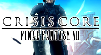
Crisis Core: Final Fantasy VII


gj30785.png

ICON0.PNG
<- recreated from the original PSP icon

LocoRoco: Midnight Carnival


Here's a list of all PSP games with achievements if you want to help me get all of these done!
 
Last edited:
Terminator, The (Sega CD)
The Terminator.png


Terminator 2: Judgment Day (NES)
Terminator 2 - Judgment Day (Should be renamed with ":" instead of "-" (SNES)
T2.png


RoboCop versus Terminator (Mega Drive)
RoboCop versus Terminator (SNES)
RoboCop versus The Terminator.png


Persona 3 Portable (PSP)
Persona 3 - Portable.png


Crystal Defenders
Crystal Defenders.png


Here's an interesting thing i can't decide for myself about Metal Gear Solid: Portable Ops. So... I'vealready submitted an icon for it before, which also looks better in my opinion than this one below, but the thing about it, is that i actually forgot a good thing about PSP titles, it's that their XMB icons, are already perfect matches for icons, also having a lot of examples where the icon of the XMB was also used for trophy packs. So, either it's better to use this one, which is the original one i upscaled from savedata files, or keep the custom made one. I personally incline towards prioritising official stuff, even if visuals suffer from it, but i guess either choice is fine, since this one is kinda bland. I'll let up to you to decide.
Metal Gear Solid - Portable Ops.png

Not some scrict rule, perhaps, but i think it's always the correct way to lean more towards the official stuff. I wish this icon looked a bit better, though...
Metal Gear Solid - Portable Ops (Logo).png

This as an alternative, maybe? Will leave it here, just in case.
 
Last edited:
Terminator, The (Sega CD)
View attachment 11484

Terminator 2: Judgment Day (NES)
Terminator 2 - Judgment Day (Should be renamed with ":" instead of "-" (SNES)
View attachment 11485

RoboCop versus Terminator (Mega Drive)
RoboCop versus Terminator (SNES)
View attachment 11486

Persona 3 Portable (PSP)
View attachment 11487

Crystal Defenders
View attachment 11491


Here's an interesting thing i can't decide for myself about Metal Gear Solid: Portable Ops. So... I'vealready submitted an icon for it before, which also looks better in my opinion than this one below, but the thing about it, is that i actually forgot a good thing about PSP titles, it's that their XMB icons, are already perfect matches for icons, also having a lot of examples where the icon of the XMB was also used for trophy packs. So, either it's better to use this one, which is the original one i upscaled from savedata files, or keep the custom made one. I personally incline towards prioritising official stuff, even if visuals suffer from it, but i guess either choice is fine, since this one is kinda bland. I'll let up to you to decide.
View attachment 11488
Not some scrict rule, perhaps, but i think it's always the correct way to lean more towards the official stuff. I wish this icon looked a bit better, though...
View attachment 11489
This as an alternative, maybe? Will leave it here, just in case.
If we had some kind of "tiny icon" mode where we used little squares, I think the original PSP icon without text would be perfect, but since we have wide icons I usually prefer having the full logo with the game title in it.

Made a tweak of my own - used the metal texture from the box art. Putting it on plain white makes it look like a Final Fantasy logo to me, haha. Like it?

mgspo 2.png
 
If we had some kind of "tiny icon" mode where we used little squares, I think the original PSP icon without text would be perfect, but since we have wide icons I usually prefer having the full logo with the game title in it.

Made a tweak of my own - used the metal texture from the box art. Putting it on plain white makes it look like a Final Fantasy logo to me, haha. Like it?

View attachment 11492
Oh yeah, absolutely works, i definetly vote on this one. It is reminiscent of FF indeed, but... suits to MGS on it's own, does respresent the portable games nicely., it's really good! If no trouble for you, make the same one for Portable Ops Plus as well with the same background for the future, if it gets added eventually, since both use the same design in their icons and all, which makes sense, the Plus being like a "Complete Edition" of sorts. Peace Walker has different designs already, but it also has an icon that can be reused from PS3 version. Which, by the way, X360's version lacks, so i'll upload one so it could be changed and saved for Peace Walker on RA in the future if it also comes out.

Metal Gear Solid Peace Walker HD
Metal Gear Solid - Peace Walker.png


Also, yeah, if tiny icon system was there, there actually wouldn't be any hassle with RA because that's the system it uses. But at the same time, i like so much the the trophy pack big icons, so it's a shame RA uses only squares. Also Xbox360 started with it, so basically RA just got it's roots from there, which is a why X360 also needs a lot of work, but not as much as RA at least.

Chrono Trigger (Steam) - Copy image to: Chrono Trigger (SNES) and Chrono Trigger (DS)

Mortal Kombat: Special Forces
Mortal Kombat - Special Forcel.png
 
Last edited:
Oh yeah, absolutely works, i definetly vote on this one. It is reminiscent of FF indeed, but... suits to MGS on it's own, does respresent the portable games nicely., it's really good! If no trouble for you, make the same one for Portable Ops Plus as well with the same background for the future, if it gets added eventually, since both use the same design in their icons and all, which makes sense, the Plus being like a "Complete Edition" of sorts. Peace Walker has different designs already, but it also has an icon that can be reused from PS3 version. Which, by the way, X360's version lacks, so i'll upload one so it could be changed and saved for Peace Walker on RA in the future if it also comes out.

Metal Gear Solid Peace Walker HD

Also, yeah, if tiny icon system was there, there actually wouldn't be any hassle with RA because that's the system it uses. But at the same time, i like so much the the trophy pack big icons, so it's a shame RA uses only squares. Also Xbox360 started with it, so basically RA just got it's roots from there, which is a why X360 also needs a lot of work, but not as much as RA at least.

Chrono Trigger (Steam) - Copy image to: Chrono Trigger (SNES) and Chrono Trigger (DS)

Mortal Kombat: Special Forces
Yeah I'll make one for Plus later. I'm not a fan of the Peace Walker icon as it doesn't have a logo. Just to be clear, we can upload custom icons for any game, we don't have to stick with PS3 or PS4 icons just because they're the "official" ones.

Uploaded the others, thanks.
 
Thanks! Same, it looks kinda meh with just Big Boss' face there without any logo or anything, at least adding a logo would fare much better. While some original PSP icons are perfect for icons, some are quite lacking and bland to use as one, would be a better idea to replace them with something pleasant and informative looking.

Alone in the Dark: The New Nightmare (PS1)
Alone in the Dark - The New Nightmare.png


Alone in the Dark (3DO)
Alone in the Dark.png


Koudelka (PS1)
Koudelka.png


Countdown Vampires (PS1) -Untracked
Countdown Vampires.png


Silent Hill (PS1)
Silent Hill.png


Play Novel: Silent Hill (GBA)
GBA.png


Chrono Cross (PS1)
Chrono Cross.png


Mortal Kombat Mythologies: Sub-Zero (PS1)
Mortal Kombat Mythologies: Sub-Zero (N64)
MKMSZ.png


Mortal Kombat: Unchained (PSP)
Mortal Kombat - Unchained.png
 
MK bootlegs and hacks! Things are about to get weird... I'm glad their title screens turned out to be perfect at least.

~Unlicensed~ Mortal Kombat II (Yoko Soft)
Mortal Kombat (Yoko Soft).png


~Unlicensed~ Mortal Kombat II Special
Mortal Kombat II Speical.png


~Unlicensed~ Mortal Kombat II (Hummer Team)
Mortal Kombat II (Hummer Team).png


~Unlicensed~ Mortal Kombat 3 (Hummer Team)
Mortal Kombat 3 (Hummer Team).png


~Unlicensed~ Mortal Kombat 3 (SuperGame)
Mortal Kombat 3 (Super Game) 2.png


~Hack~ Ultimate Mortal Kombat Trilogy
Ultimate Mortal Kombat Trilogy.png


Official one for the last, couldn't decide which suits better, though... up to you :D

Mortal Kombat Trilogy (PS1)
Mortal Kombat Trilogy (N64)
Mortal Kombat Trilogy.png

Mortal Kombat Trilogy 3.png
 
Last edited:
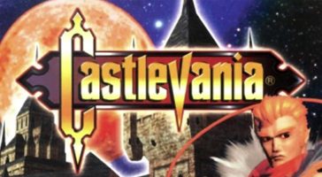
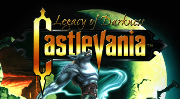
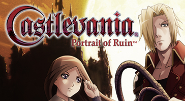
Thanks, uploaded most of those but preferred cropping the box art for Castlevania 64 and made one for Portrait of Ruin where I positioned the artwork and logo differently. Sometimes it's better to move things around a bit to avoid covering faces and that sort of thing, don't worry too much about keeping the logo in the middle. The Dawn of Sorrow has the same issue but I can see that artwork might be tricky to work with.

But aside from that (and that's me nit-picking, sorry!) these are great and you're really helping out with the Retro icons, well done!
 
Here are the new icons and I also did Legacy of Darkness:

137660j.png


8j5d76d.png


j05b406.png


By the way here are a couple of useful sites for artwork:

https://www.steamgriddb.com/
https://www.nintendo.co.uk/Search/Search-299117.html?q=castlevania&f=147394-86

^ If you want to take an image from the Nintendo UK site, try removing things like "_image500w" or "_image1600w" from the image URL before you save it. Very often the original image file is being upscaled or downscaled so you want to get the original source file. Sometimes there is no unscaled image though.

I hope that's helpful!
 
Thanks, uploaded most of those but preferred cropping the box art for Castlevania 64 and made one for Portrait of Ruin where I positioned the artwork and logo differently. Sometimes it's better to move things around a bit to avoid covering faces and that sort of thing, don't worry too much about keeping the logo in the middle. The Dawn of Sorrow has the same issue but I can see that artwork might be tricky to work with.

But aside from that (and that's me nit-picking, sorry!) these are great and you're really helping out with the Retro icons, well done!

Absolutely yes, the one on the Castlevania 64 works a ton better! I was a bit tied up with with the lack of material to work with, that's why it kinda lacked, but this one you uploaded works amazing, yes. Same for Dawn of Sorrow, too... I think it's the one i'm dissapointed the most, but there is barely any other official art that i could use that wouldn't either crop other faces in the art or cover them. It's just... a lot of going on there haha. Hopefully, maybe we could come up with something better eventually, works for now... i guess. Legacy of Darkness and Portrait of Ruin worked perfectly too, i absolutely loved it's replacement. The logo positioned on top of the moon makes it much more readable which is perfect!

Yeah, thanks for the advice about the logos, will try experiment here and there, but... yeah, the logos in the middle are sometimes quite problematic. I try as much as i can to not cover anything, but also depends on the logo and the art itself. If the art or the logo are somewhat attention grabbing, they're very hard to leave somewhere except centered. Sometimes it just... kinda doesn't look right off centered or become unreadable if smaller. I gotta say it's very rewarding though when you do find you a way to have it looking good haha

Oh, the nit-picking is most welcome, i myself try to be very strict and thorough when it comes to such things, so, like i said before, if you feel there's somewhere you could correct, give advice or find a better replacement, i would very appreciate it! And yeah, So glad my submissions are working out well and are great help, thank you so much!!!

As for the websites, thanks! Steam Grid is the one i use quite frequently, very handy indeed, but the trick with Nintendo website was actually not known to me, many thanks! There's also another one called LaunchBox that can sometimes supply some nice artwork or covers for the game you could be looking for, you just have to register there, though. But it's also very handy when you're looking for original artwork, logo or scans! If hi res covers are something you are specifically looking for, The Cover Project is also great help!
 
Last edited:
Uploaded these, I also uploaded the Sinister Six icon for the Game Gear version since it shares the same box art.

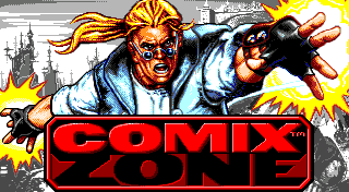
For Comix Zone, were you trying to match the original icons but in better quality/higher resolution? I appreciate the effort, but since those icons are all based on the same logo and artwork it's really not necessary. Also the PS3 icon was just the logo with a transparent background. I asked x3sphere about those icons a while ago and we agreed we prefer icons with a solid background instead, it's more consistent with other icons.

Anyway, I looked up the title screen for the game and preferred it (it makes a fantastic icon) so I've uploaded that for all versions instead.

25782.png


That game is 320 pixels wide, which is perfect as one of the icon sizes is 320 x 176, so if you ever make an icon from a title screen that's 320 pixels wide there's no need to scale it up to 364 x 200, just use 320 x 176 instead, it will end up looking a little better that way. If you use a title screen (or pixel/sprite graphics in general) that's smaller than 320 (like a GBA game) I would recommend using nearest neighbour scaling to scale it to 200% (it's okay if it goes above 320, the site will then scale it down).

I hope that makes sense. If it's a bit complicated or if you don't know how to do nearest neighbour scaling then just upload the original unscaled image and I'll scale it for you. That only applies to retro pixel graphics though, stick to 364 x 200 for other games 👍
 
Last edited:
Back
Top