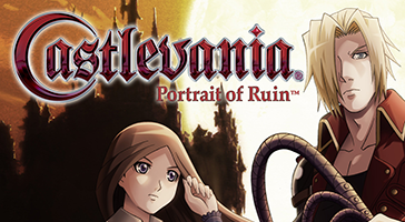
Thanks, uploaded most of those but preferred cropping the box art for Castlevania 64 and made one for Portrait of Ruin where I positioned the artwork and logo differently. Sometimes it's better to move things around a bit to avoid covering faces and that sort of thing, don't worry too much about keeping the logo in the middle. The Dawn of Sorrow has the same issue but I can see that artwork might be tricky to work with.
But aside from that (and that's me nit-picking, sorry!) these are great and you're really helping out with the Retro icons, well done!
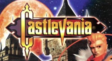
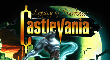
Absolutely yes, the one on the Castlevania 64 works a ton better! I was a bit tied up with with the lack of material to work with, that's why it kinda lacked, but this one you uploaded works amazing, yes. Same for Dawn of Sorrow, too... I think it's the one i'm dissapointed the most, but there is barely any other official art that i could use that wouldn't either crop other faces in the art or cover them. It's just... a lot of going on there haha. Hopefully, maybe we could come up with something better eventually, works for now... i guess. Legacy of Darkness and Portrait of Ruin worked perfectly too, i absolutely loved it's replacement. The logo positioned on top of the moon makes it much more readable which is perfect!
Yeah, thanks for the advice about the logos, will try experiment here and there, but... yeah, the logos in the middle are sometimes quite problematic. I try as much as i can to not cover anything, but also depends on the logo and the art itself. If the art or the logo are somewhat attention grabbing, they're very hard to leave somewhere except centered. Sometimes it just... kinda doesn't look right off centered or become unreadable if smaller. I gotta say it's very rewarding though when you do find you a way to have it looking good haha
Oh, the nit-picking is most welcome, i myself try to be very strict and thorough when it comes to such things, so, like i said before, if you feel there's somewhere you could correct, give advice or find a better replacement, i would very appreciate it! And yeah, So glad my submissions are working out well and are great help, thank you so much!!!
As for the websites, thanks! Steam Grid is the one i use quite frequently, very handy indeed, but the trick with Nintendo website was actually not known to me, many thanks! There's also another one called
LaunchBox that can sometimes supply some nice artwork or covers for the game you could be looking for, you just have to register there, though. But it's also very handy when you're looking for original artwork, logo or scans! If hi res covers are something you are specifically looking for,
The Cover Project is also great help!