Somfing
Active Member
I think the current icon (which you made) is better.New icon for Rayman 2: The Great Escape (RA N64)
Last edited:
I think the current icon (which you made) is better.New icon for Rayman 2: The Great Escape (RA N64)
Thanks! You mean the icon of Rayman 2 or Jungle Climber?I think the current icon (which you made) is better.


If there's an icon for a game on the site that you'd like to see updated, please use this thread to submit suitable replacements! This thread is meant for replacing icons with obvious visual issues (e.g. poor quality due to compression, cropping issues, etc).
Guidelines
- Focus should be on the game logo, only use official artwork/boxart (no fan art)
- The image must be in PNG format so no compression artifacts are present
- Recommended size is 364x200, or 288x158 if larger assets are not available.
- Link to the associated game page next to each image replacement
- Please upload images as an attachment here, as some image hosts will compress images


")
Hi @Thejacs , I'm the one from Discord earlier, I apologize because I forgot to mention that there are rules for this, here they're :
These aren't beautifully edited, but maybe something like this, I hope you don't mind
View attachment 13615Skies of Arcadia Achievements - Retro
Achievements, guides, leaderboards, and discussion forums for Skies of Arcadiawww.exophase.com
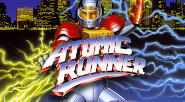
View attachment 13616Atomic Runner Achievements - Retro
Achievements, guides, leaderboards, and discussion forums for Atomic Runner
View attachment 13617View attachment 13618
The admin or staff will change them for you later
Yep, they are just a cut from the boxart, what I mean is just the image cropping itself, logo placement and its effects that I added, such as the shadows, stroke lines and outer glows, and my works might be not "beautiful". Sorry for the confusion, I'm not good at speaking EnglishBut what you mean with "beautifully edited"? I see on the rules it must be limited to the official artwork/Boxart.
These aren't "beautiful edited", just a cut from the official european box

Ohhh, ok my friend, I thought you were talking about my images. Yours are perfect, just what I wantedYep, they are just a cut from the boxart, what I mean is just the image cropping itself, logo placement and its effects that I added, such as the shadows, stroke lines and outer glows, and my works might be not "beautiful". Sorry for the confusion, I'm not good at speaking English
And you are very welcome!
Hi my friend, aparently I did something wrong because nobody change the last icon I uploaded.Yes, correct size and a link, sharper image (not noisy nor blurry) also more preferable of course.