• Steam recently changed the default privacy settings for all users. This may impact tracking. Ensure your profile has the correct settings by following the guide on our forums.

[Competition] Design A GamerCard

FrozenIpaq

Justin B / Supp. Editor
Enforcer Team
Where does it say eXophase.com gamercard on there!?

It's just a concept, it can bet fitted in between the two sections or along the side

EDIT: Since you'll probably bother me for a version with it in to see how it looks:
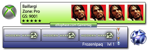
4955395721_1675fe7e6f.jpg


Of course it can be implemented in many other ways but that was just one
 

x3sphere

Administrator
Staff member
Enforcer Team
Game Info Editor

x3sphere

Administrator
Staff member
Enforcer Team
Game Info Editor

x3sphere

Administrator
Staff member
Enforcer Team
Game Info Editor
Ah sorry

Btw @X3 Did you get my PM?

I did, thanks :)

EDIT: oh and just a heads-up that the deadline for entries is September 25. We'll announce the winners soon after.
 
Alright, here's my shot at this.

Gamercard.png


Veeery early WIP. Note that I still have to fix the horizontal strokes, I intend for them to match the colour of the diagonal divider, and probably add a few more while making them more narrow vertically. The font choice, Consolas, worked against me. Looked fine @ 200%, but blurred badly at normal size. The overall design's a tad flat as well. Also had a bit of difficulty trying to fit the 5x Live thumbs. It's also supposed to be colour-changeable.

Here's the PSD. Others may also want to use this as a template; i've got all the thumbnails neatly orgainsed into folders and on separate layers, so it may save you some time.

EDIT: It just hit me I totally ripped off xploren's design. Didn't mean to that, I thought it was oddly creative of me :/ .
EDIT2: I also forgot the exophase.com text. I'll add that later.

EDIT3:

Darkchild, your's looks pretty damn good. The pixel font looks awesome, and the transparent style opens up doors for changeable backdrops.

EDIT4: I also missed Menace's resource pack... That would've come in handy...
 

MenaceInc

Staff Member
It's just a concept, it can bet fitted in between the two sections or along the side

EDIT: Since you'll probably bother me for a version with it in to see how it looks:

4955395721_1675fe7e6f.jpg


Of course it can be implemented in many other ways but that was just one

I really like the gradient effect on it. Maybe a different colour as well for Steam? Instead of the blue there could be the grey that Steam uses.


View attachment 8678

here's mine :)

(Yeah, I know, it is TERRIBLE)

Really like the font used there. Also, the way you have "exophase Gamercard" rotated is really nice. Nice work :D
 

Freshmilk

is Over 9000
Looks really good. Only suggestion I'd make is changing the yellow bars to blue perhaps?

Hmm. Maybe I could have it work with Chathurga's colour changer? It might be good to have it in a selection of different colours, given that you think it'd be good in blue, but Frozen liked the yellow. Theres only like 5 different colours in it, so it should be easy to recolour.

Anyway, its nice to see more entries coming in. I've seen some I've really liked, too. Seems like the competition is picking up a bit now, which is a good thing; though, I'd like to see more compact gamercard designs. I'm interested to see how people would lay them out, since I couldn't even fit an avatar on mine. :scared:
 

Freshmilk

is Over 9000
Wow, Moose, I really like the new design. I wouldn't change a thing. Nice work, dude. Have you created a side for steam yet? I wonder what that'd look like... Also, I'm sure I've got my design from MfM lying around somewhere. I didn't realise we could use those, though mine wasn't much to look at anyway. I'm sure if you polish those up though, to make them fit the contest rules, they'd make pretty good entries, too. :)
 

Moose

Meta Moose
Hah, just realised I got the trophy numbers the wrong way around on mine... xD

EDIT: A simple, minamalistic gamercard:

108i6h1.png
 
Top